

The Three-Color Design Principle: A Deep Dive into Chromatic Mastery
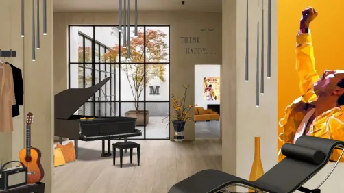
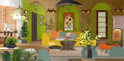
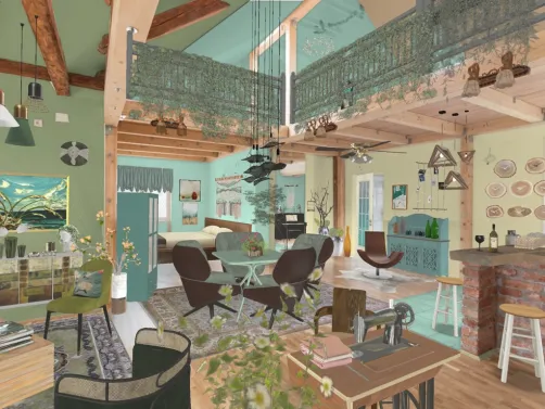
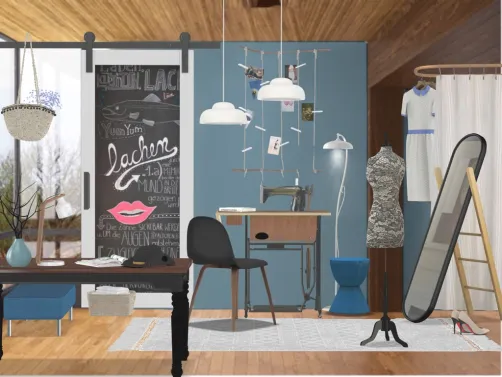
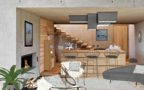
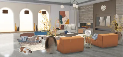
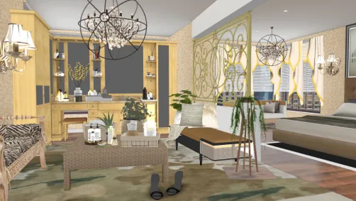
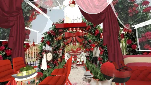
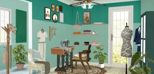
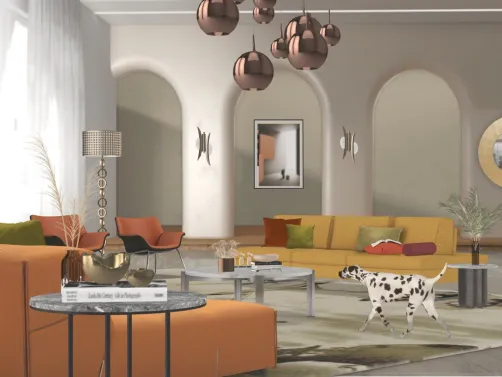
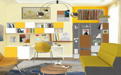
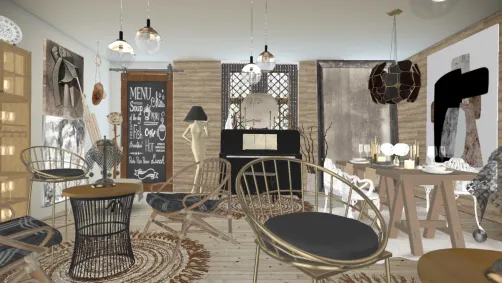
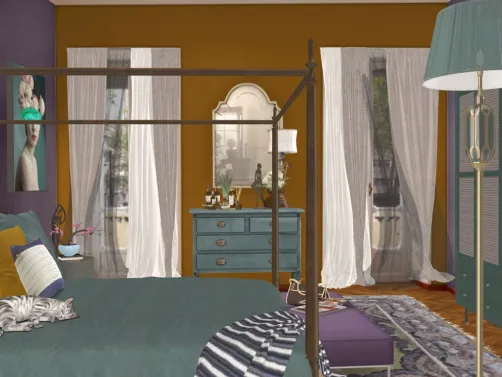
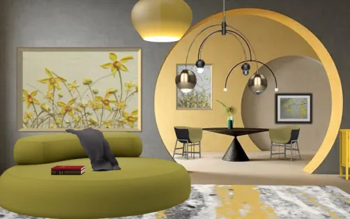
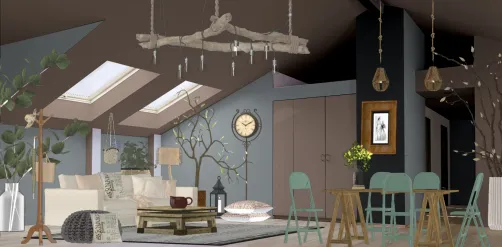
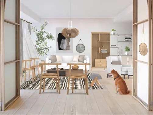
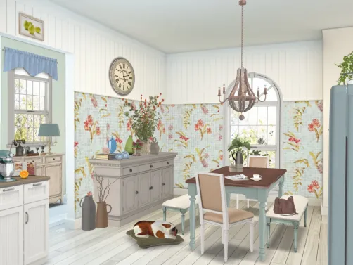
The 'ThreeColorsContest' isn’t a style per se—it’s a foundational design principle rooted in color theory and visual economy. Drawing from the trichromatic model used in print (CMY) and digital display (RGB), this contest challenges designers to distill complexity into clarity using only three hues—regardless of saturation, tone, or application context. Unlike rigid stylistic movements (e.g., Mid-Century Modern or Scandinavian), this principle is agnostic to era, culture, or function: it prioritizes intentionality over ornamentation, harmony over hierarchy, and restraint as a creative catalyst. Winning entries—from Morgan Cotter’s minimalist chromatic study to Mary Valerio’s vibrant homage to Freddie Mercury—demonstrate how limiting palette doesn’t limit expression; instead, it amplifies focus, sharpens contrast, and deepens emotional resonance. This is not monochrome minimalism—it’s polychrome precision.
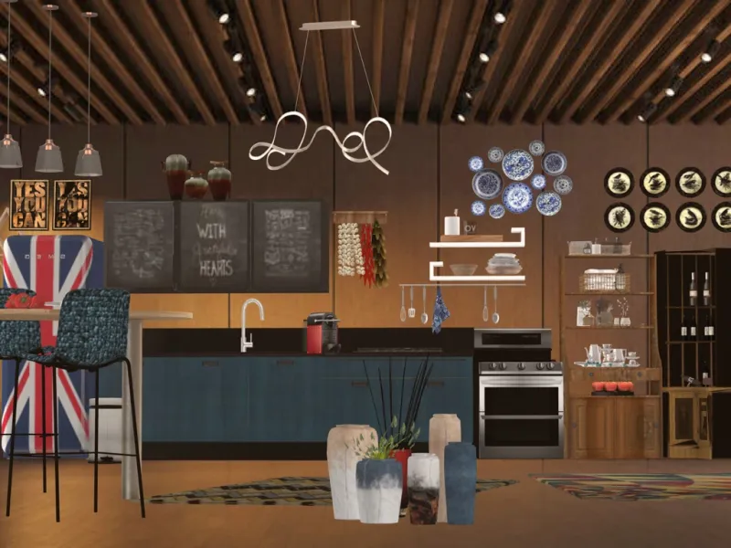
Featured work: betisky’s 'kitchen' — a clean, functional space where red, white, and black form a bold yet balanced triad. In Homestyler’s 3D rendering engine, this effect is achieved instantly: select any three base colors in the Material Palette, apply them to dominant surfaces (cabinets = red, countertops = white, backsplash = black), and use the 'Color Harmony Preview' tool to simulate tonal relationships before finalizing. No manual tweaking—just strategic assignment and real-time visual feedback.
Start Designing Now🎨 Chromatic Discipline: The Power of Triadic Restraint
At its core, the Three-Color Principle enforces disciplined color selection—not arbitrary limitation. Designers must choose three hues that interact dynamically: one dominant anchor, one supporting contrast, and one subtle accent—or deploy them equally across spatial zones to create rhythm. This avoids visual noise while enabling high-impact storytelling: e.g., red for warmth and energy, blue for calm and depth, yellow for optimism and light. Crucially, neutrals (white, black, gray) count as valid 'colors' within the trio—making monochromatic schemes with tonal variation fully compliant. The constraint fosters innovation: when you can’t rely on dozens of shades, you learn to leverage texture, lighting, and proportion to amplify chromatic intent.
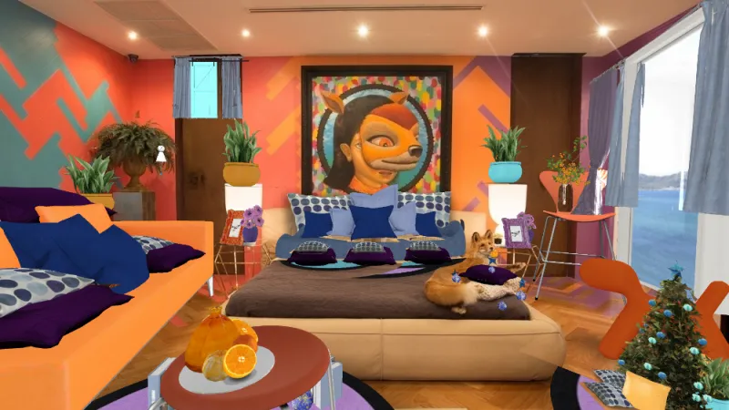
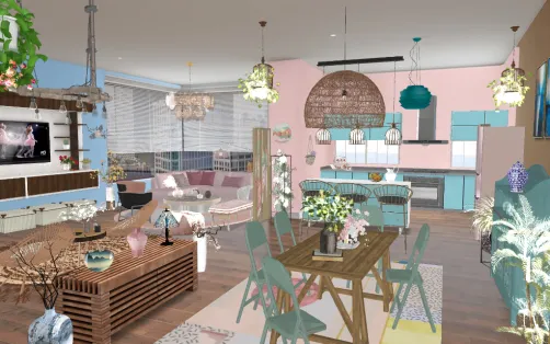
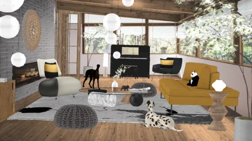
Bell Imamovic’s '💌' exemplifies triadic discipline: soft pink, warm beige, and deep charcoal define walls, furniture, and decor respectively—each hue occupying a distinct spatial layer without overlap. In Homestyler, replicate this by using the 'Zone-Based Color Assignment' feature: draw room zones (wall, floor, ceiling), assign one color per zone via the Color Picker, and lock saturation values to maintain tonal consistency across materials—even when switching from matte paint to glossy tile.
Create Your Dream Room📐 Spatial Choreography: Balancing Volume, Plane & Accent
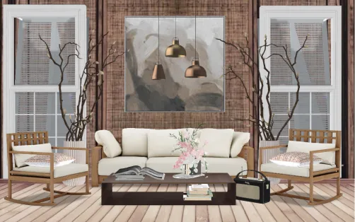
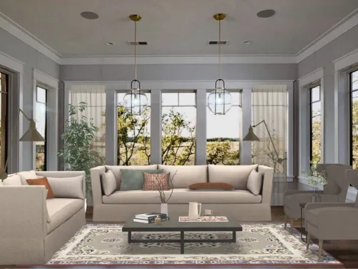
Three-color composition demands structural awareness. Successful designs allocate hues intentionally across spatial dimensions: large planes (walls, floors) carry foundational tones; volumetric elements (sofas, cabinets) introduce secondary contrast; and small accents (vases, lamps, art) deliver tertiary punctuation. This creates visual hierarchy and directional flow—guiding the eye through space like a conductor guiding an orchestra. Proportional balance matters: a 60-30-10 rule often applies (60% dominant, 30% secondary, 10% accent), but top entries like Stacey Stevens’ 'Barely There' invert expectations—using near-white as dominant, sage green as volume, and rust as micro-accent—to achieve ethereal lightness without sacrificing chromatic clarity.

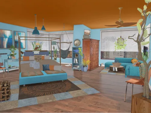
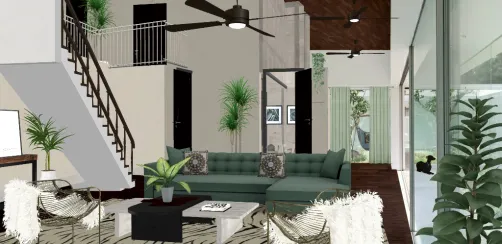
Eliane Siciliano’s Portuguese-captioned entry translates directly: 'Primary colors were chosen for this space—the result is sober, cozy, and delicate.' Here, cobalt blue (walls), crisp white (ceiling/furniture frame), and burnt orange (textiles/accessories) choreograph spatial perception—blue recedes, white expands, orange advances. In Homestyler, achieve this instantly using the 'Smart Surface Mapping' tool: upload a floorplan, tag wall/ceiling/furniture layers, and apply the three hues with one-click material sync—no manual UV unwrapping or texture tiling required.
Begin Your Design Journey✨ Textural Counterpoint: When Hue Meets Tactility
With only three hues available, texture becomes a critical expressive channel. Matte vs. glossy, rough vs. smooth, woven vs. polished—these contrasts add dimensionality without introducing new colors. Top entries leverage this masterfully: Lillian Saunders’ 'The Girl Behind The Hat' pairs rich navy velvet (hue #1), brushed brass hardware (hue #2), and ivory linen (hue #3), where materiality defines character as much as chroma. Likewise, Jaque Verceze’s 'little Dream' uses translucent acrylic, frosted glass, and soft wool—all in the same blue family—to create layered luminosity. Texture isn’t decoration here—it’s chromatic extension.
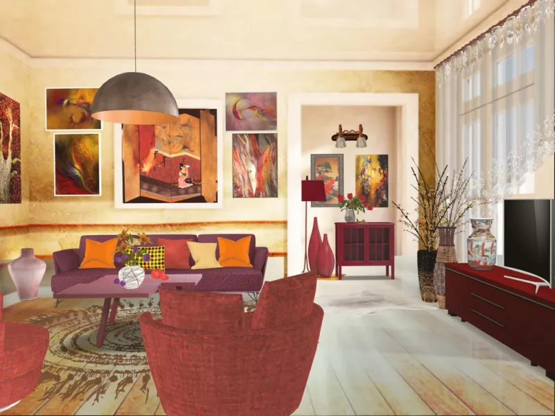
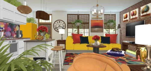
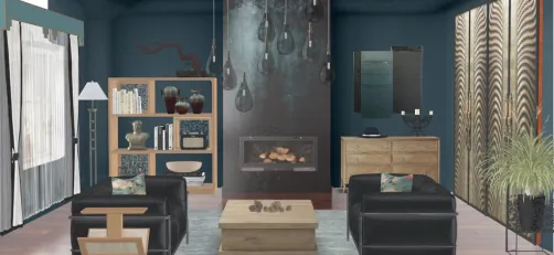
Bade’s 'a room w fiery colors 💥🔥🔥🔥🔥' uses crimson, charcoal, and gold—not as flat swatches, but as textural events: crimson appears as nubby bouclé upholstery, charcoal as honed concrete flooring, and gold as hammered metal sconces. In Homestyler, this is streamlined via the 'Material Texture Library': filter by hue, then drag-and-drop photorealistic textures (e.g., 'Woven Crimson Wool', 'Matte Charcoal Concrete', 'Antiqued Gold Metal') onto surfaces—auto-adjusting lighting response and scale for true-to-life rendering.
Launch Your Design ProjectFAQ
Q: Do the three colors have to be primary colors (red, blue, yellow)?
No—they can be any three hues: primaries, secondaries, pastels, neons, or even neutrals like black, white, and gray. The contest title 'ThreeColorsContest' refers to the quantity, not the type.
Q: Can I use tints, shades, and tones of the same base hue?
Absolutely—and it’s encouraged! Using light blue, navy, and sky blue counts as one hue family, so you’d still need two additional distinct hues to complete the trio.
Q: Does Homestyler offer tools to validate my three-color palette before rendering?
Yes. Use the 'Palette Inspector' in the Design Assistant panel: upload your cover image or select materials, and it auto-identifies dominant hues, calculates contrast ratios, and flags accidental fourth colors—ensuring full contest compliance in seconds.
Originally incubated at Autodesk, Homestyler has grown into one of the most widely adopted home design platforms in the world, now trusted by over 20+ million users. Whether you're a homeowner exploring ideas or a professional designer delivering client-ready renders, Homestyler brings industry-leading 3D technology to your fingertips — no experience required.
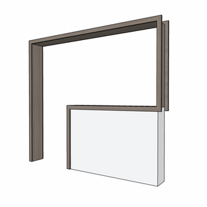
Minimalist Solid Wood Floating Wall Mounted Console Table 3D Model

Minimalist Black Metal Glass Room Divider Screen 3D Model
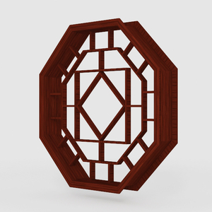
Vintage Solid Wood Octagonal Chinese Window Grille 3D Model
Homestyler is an easy-to-use online home design platform that offers powerful 3D rendering tools, inspiring design projects, and helpful DIY video tutorials. It’s perfect for turning your interior design ideas into stunning, realistic visuals.
Дизайн сейчас бесплатно