

The Blue Serenity Style Decoded
The 'Shades of Blue' contest celebrates blue not merely as a color—but as an emotional language. Rooted in its universal symbolism—trust, loyalty, wisdom, calmness, and intelligence—this style transcends trendiness to embody intentional tranquility. It draws inspiration from the sky’s soft gradients and the sea’s layered depths, translating them into interior spaces that breathe stillness. Unlike monochromatic minimalism or bold nautical themes, this aesthetic favors nuanced tonal layering: icy cerulean walls paired with dusty denim upholstery, misty periwinkle textiles against warm oak flooring, or navy accents softened by ivory trim and matte brass hardware. The result is a serene yet sophisticated environment—neither cold nor clinical, but deeply comforting and psychologically grounding. This is blue not as backdrop, but as atmosphere.
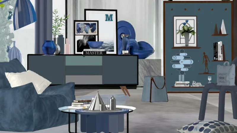
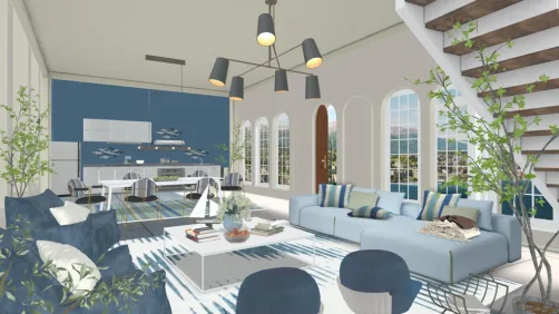
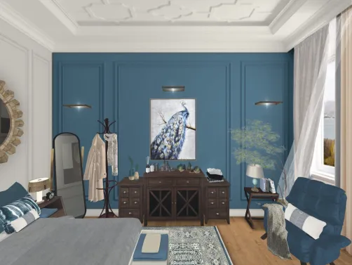
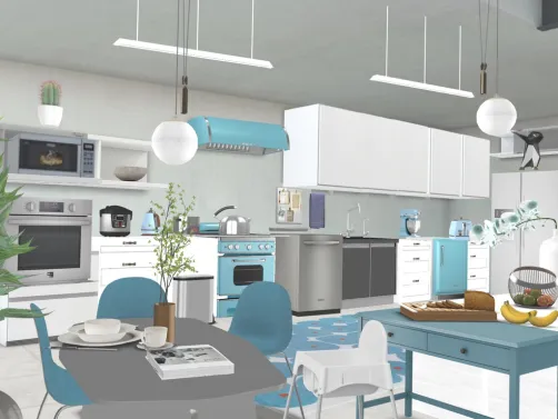
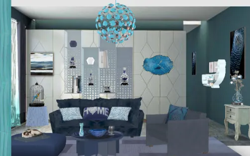
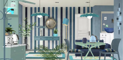
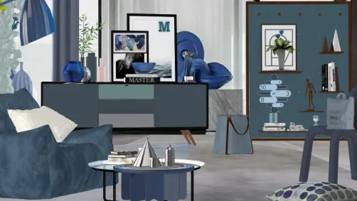
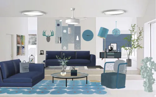
Featured work: Mary Valerio's "Blue..." — a masterclass in atmospheric tonal harmony. Using Homestyler’s real-time material swap and lighting simulation tools, she achieves depth without clutter: pale blue walls recede gently, while rich indigo velvet armchairs anchor the composition. The subtle interplay of matte and satin finishes—visible in Homestyler’s PBR rendering engine—adds tactile sophistication. With just a few clicks in Homestyler’s AI-powered palette assistant, designers can replicate this cohesive gradient logic across any room type.
Start Free Design💙 Blue as Emotional Architecture
Blue is never just decorative here—it functions as spatial psychology. Lighter tones (sky blue, powder blue) visually expand rooms and lower perceived ceiling height for intimacy; mid-tones (cornflower, slate) provide balanced neutrality ideal for living areas; deeper shades (navy, sapphire) create enveloping, cocoon-like zones—perfect for bedrooms or reading nooks. Crucially, saturation is deliberately restrained: no electric cobalts or fluorescent teals. Instead, pigments carry subtle gray or green undertones, echoing natural light diffusion. In Homestyler, users leverage the ‘Mood Lighting’ slider and ‘Material Reflectivity’ controls to fine-tune how each blue behaves under simulated daylight vs. warm artificial light—ensuring emotional intent remains consistent across time of day.
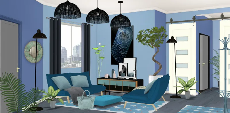
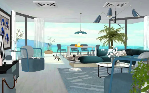
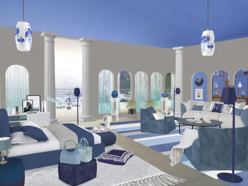
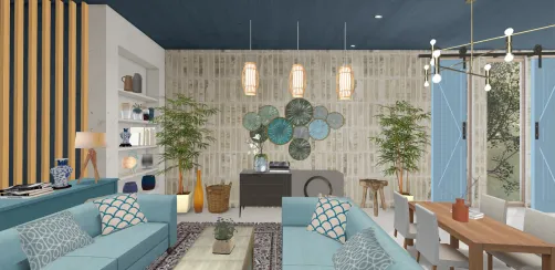
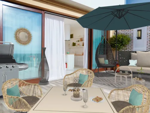
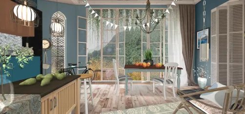
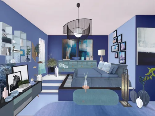
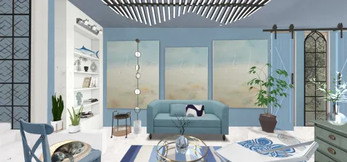
Featured work: Alita 🌷's "💙" demonstrates blue as quiet authority. A single, saturated yet muted cobalt accent wall becomes the soul of the space—not shouting, but holding presence. Homestyler’s one-click ‘Wall Color Match’ tool lets users instantly extract and apply that exact tone to adjacent surfaces or furniture fabrics. Notice how the blue harmonizes with raw linen curtains and bleached oak flooring—achievable in Homestyler via the ‘Natural Texture Library’ and ‘Wood Grain Overlay’ feature—proving that serenity thrives in restraint, not repetition.
Begin Your Blue Style🪑 Structural Calm Through Proportion & Line
This style avoids visual noise through disciplined structure: clean lines, uncluttered sightlines, and purposeful negative space. Furniture selections favor low-profile silhouettes (sofas with slim arms, pedestal dining tables), horizontal emphasis (wide-plank flooring, linear shelving), and organic geometry (curved sectionals, oval coffee tables) to soften rigidity. Walls remain largely unadorned—no gallery grids or busy wallpaper—allowing color itself to become the primary compositional element. In Homestyler, the ‘Furniture Scale Assistant’ ensures proportional harmony, while the ‘Grid Snap Toggle’ and ‘Axis Alignment Tool’ help maintain architectural clarity—even when rotating or resizing pieces in complex 3D scenes.
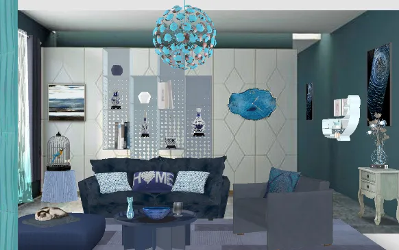
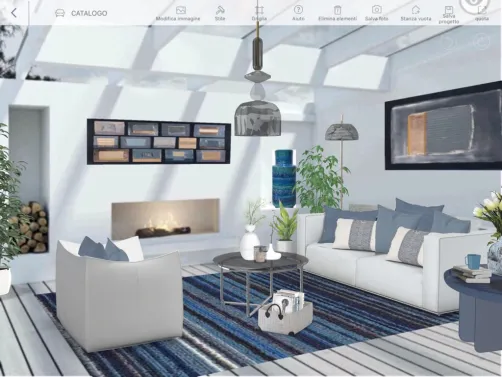
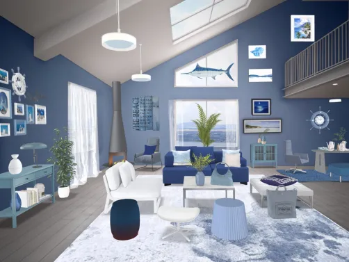
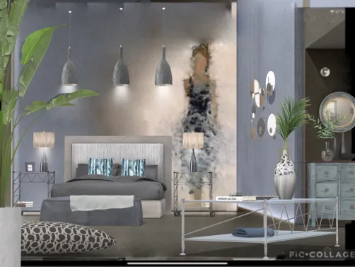
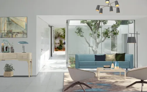
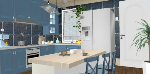
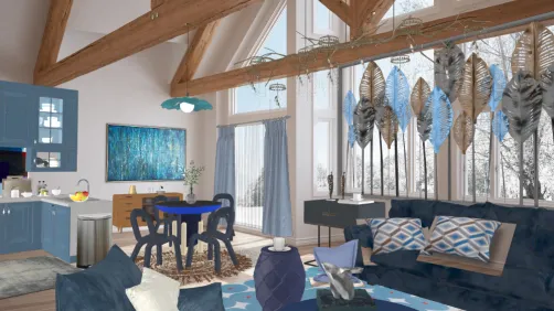
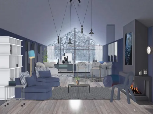
Featured work: Angela Zarzaca's "Blue living room" exemplifies structural calm. Note the uninterrupted floor-to-ceiling window framing nature, the low-slung sofa aligned precisely with the rug’s edge, and the absence of wall decor—only a single sculptural floor lamp provides vertical rhythm. In Homestyler, this precision is effortless: use the ‘Room Boundary Auto-Detect’ to lock dimensions, then apply ‘Symmetry Mode’ when placing key elements like seating or lighting. The result? A space that feels both rigorously composed and effortlessly peaceful—a hallmark of the Shades of Blue ethos.
Create Calm Spaces🌿 Textural Harmony & Natural Anchors
Texture is the silent counterpoint to blue’s coolness—introducing warmth, tactility, and organic authenticity. Think nubby wool throws, hand-thrown ceramic vases, rattan pendant lights, linen upholstery, and honed stone countertops. These materials don’t compete with blue; they deepen its resonance. Wood elements are always warm-toned (oak, walnut, ash)—never cool-toned maple or birch—to prevent visual chill. Plants are non-negotiable: trailing pothos, sculptural fiddle-leaf figs, or airy eucalyptus branches reinforce the sky-and-sea motif while adding life and softness. Homestyler’s ‘Material Physics Engine’ renders fabric drape, wood grain variation, and plant translucency realistically—so users preview how texture interacts with blue light before finalizing designs.
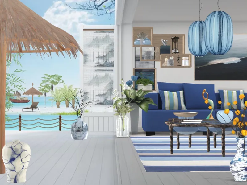
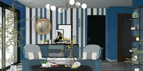
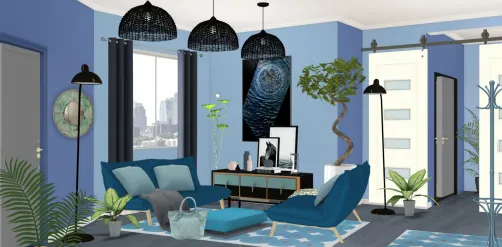
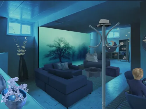
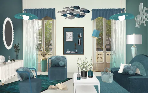
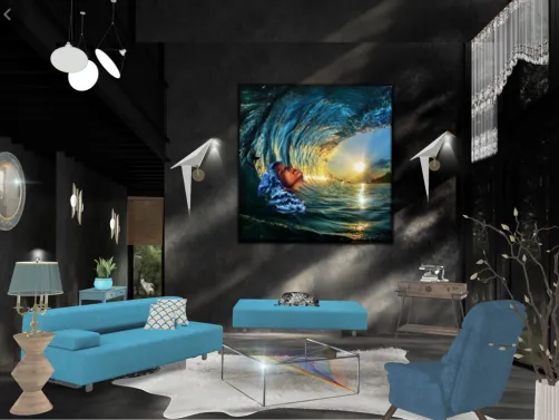
Featured work: Eliane Mendes Escudero Puga's "room" reveals texture as emotional translator. A woven jute rug grounds the space beneath a smooth blue sofa; rough-hewn wooden side tables contrast with glossy ceramic lamps; and a cascade of ivy softens the window frame. In Homestyler, access these textures instantly via the ‘Nature-Inspired Material Pack’—tagged with filters like ‘Organic’, ‘Matte’, and ‘Tactile’. With one drag-and-drop, users embed biophilic realism into their blue schemes—making serenity feel lived-in, not staged.
Design Your SerenityFAQ
Q: What makes 'Shades of Blue' different from generic blue-themed interiors?
A: It’s defined by emotional intentionality—not just color choice. It prioritizes tonal nuance over boldness, structural calm over ornamentation, and textural warmth over cool sterility. Every blue selected serves a psychological function within the space.
Q: Can I achieve this style quickly in Homestyler—even as a beginner?
A: Absolutely. Use Homestyler’s ‘Blue Serenity’ preset scene library, the AI Color Palette Generator (set to ‘Tranquil’ mode), and the ‘Texture Sync’ tool to auto-match materials across surfaces. Most award-winning entries were built in under 45 minutes.
Q: Are there specific blue shades recommended for small or dark rooms?
A: Yes—lighter, gray-leaning blues (e.g., ‘Morning Haze’ or ‘Driftwood’) reflect light and enhance airiness. Homestyler’s ‘Light Simulation Toggle’ lets you test how each shade performs at dawn, noon, and dusk before committing.
Q: Do I need professional design knowledge to join the contest?
A: No. The Shades of Blue Contest welcomes all skill levels. Homestyler’s guided tutorials, real-time rendering feedback, and community design challenges make it accessible—and the top 5 winners included three first-time users.
Originally incubated at Autodesk, Homestyler has grown into one of the most widely adopted home design platforms in the world, now trusted by over 20 million users. Whether you're a homeowner exploring ideas or a professional designer delivering client-ready renders, Homestyler brings industry-leading 3D technology to your fingertips — no experience required.

Vintage Teal Gold Trim Glass Top Round Coffee Table 3D Model
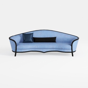

Modern Blue Fabric Black Trim Curved Sofa 3D Model

Minimalist Navy Blue Solid Wood Storage Coffee Table 3D Model
Homestyler is a user-friendly online home design platform that lets you create stunning 3D renderings, explore diverse design projects, and learn through easy DIY video tutorials. It’s perfect for bringing your interior decoration ideas to life with ease and inspiration.
Дизайн сейчас бесплатно